By Nick Gelling
Product Test Journalist | Kaipūrongo Whakamātautau Hautaonga
One mobile provider has ended a consumer-friendly initiative we praised last year, while another has moved to a new app that’s significantly less helpful than the old one.

Each year, we review how well the three biggest mobile providers – 2degrees, Spark and One NZ – empower consumers to get on the best phone plan for them.
This is the first time since the review began in 2022 that we’ve seen no improvements across the board – and, in some cases, a poorer service than the previous year.
Telecommunications commissioner Tristan Gilbertson hopes this is a one-off dip.
“It's disappointing that the historic leader, 2degrees, has fallen to the bottom of the pack and Spark is planning to move away from its right-planning initiative, which we praised last year. We will be making requirements clear to providers in the coming weeks,” he said.
Our assessment of the three providers
We collaborated with the Commerce Commission on this review, which is based on agreements the commission made with providers in 2021. These agreements included providing customers with:
at least 12 months of historical usage and spend information
an annual summary of their usage and spend, along with a prompt to consider alternative options.
Armed with this information, consumers can make meaningful choices between plans and providers.
We assessed the most recent version of each provider’s mobile app and annual summary that was available within the review period (1 July 2024 to 30 June 2025).
2degrees
Mobile app: 69%
Annual email summary: 60%
Overall: 65%
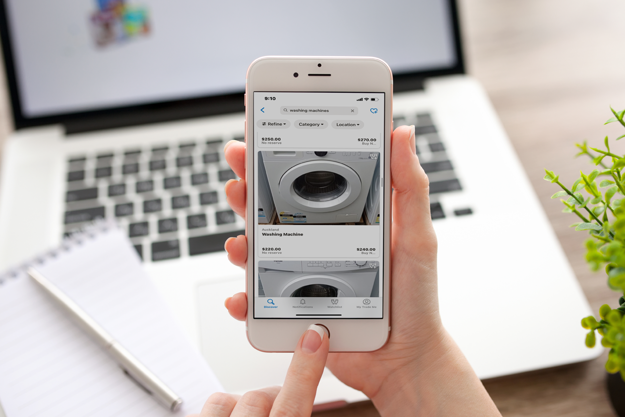
2degrees recently completed a migration to a new app to unify its mobile, broadband and electricity customers.
Unfortunately, the excellent 2degrees app experience we’ve grown accustomed to hasn’t translated to the new platform.
Usage data is now only available in a daily view, making it much harder to understand usage patterns over several months. The old app defaulted to a monthly view but could be broken down by day.
Spend data is now simply a list of events and how much they cost. There are no charts to visualise cost over time, filters to separate different types of spending, or summaries (aside from a sum of how much you’ve spent since your last bill).
On the positive side, usage and spend data are still easy to access, and it’s simple to swap between data, call and text histories.
Users will also be able to scroll back indefinitely – past the standard 12 months. However, the app doesn’t have data from before the migration, so this is only a theoretical benefit for now.
2degrees promises “further enhancements to come” to its app. For example, it’s indicated that historical spend data will be available in a chart format soon.
As part of the migration, 2degrees paused its annual “Happy Anniversary” emails at the end of June, which could lead to some customers missing out on a summary this year.
New summaries are coming, but 2degrees is taking some time to think about what they should look like. We invite 2degrees to take this chance to add information missing from its previous summaries – charts of actual monthly data, out-of-plan spend, and a recommendation for any better plan option.
Spark
Mobile app: 85%
Annual email summary: 72%
Overall: 80%
Despite not making any improvements since last year, Spark’s app now stands alone at the top. It contains the best information of the three apps and is the easiest to understand.
Spark’s email summaries were also good. They included adequate usage data and recommended a specific plan to each customer based on actual usage (a practice known as ‘right-planning’).
However, the summaries were paused “for review” in February 2025.
New summaries are expected to start rolling out this month, but we are disappointed with what we’ve seen of Spark’s new system.
The new emails will not contain usage data. Instead, they will encourage customers to click through and log in to a web page to see any information.
Spark is also abandoning its innovative right-planning focus. Last year, we praised the plan recommendations it gave as a great development, and we’d like to see them return.
One NZ
Mobile app: 63%
Annual email summary: 74%
Overall: 67%
There have been no changes to One NZ’s information sharing since 2024.
It continues to have the best annual email notification, featuring 12 months of data, prominent monthly averages and details of other available plans.
However, our bugbears with the app remain – customers can only see the latest 2–3 months of their history, and regular plan spend and extra costs are listed in different places without a combined total.
One NZ told us it’s working on system upgrades behind the scenes that could fix these failings and hopefully improve its ranking.
How the rankings have changed
2degrees was the clear leader when the review began in 2022, but its new app has had a shaky start. We urge 2degrees to take steps to restore the app to the quality of its predecessor.
Annual summaries are useful (when consumers read them)
According to our surveying, more New Zealanders than ever are using annual summaries to review their mobile contracts.
While only one in five customers recalled receiving a summary in the 2025 survey, of those who did, over two-thirds found it helpful for reviewing their current plan. This is a decent increase from the 2024 figure.
So, the next time you get an email or letter from your mobile provider titled something like “Your year in review” or “Is it time for a plan checkup?”, don’t ignore it. There’s a good chance it’ll help you reduce your bills or get better service.

Is it time to switch mobile providers?
When it comes to mobile providers, New Zealanders like a “set and forget” approach. But you might be spending more than you need to.