Booking a weekend break to see a concert should be simple enough, right? Buy your gig tickets, book your flights and find accommodation. All that’s left is to brush up on the lyrics.
But businesses’ attempts to influence you into spending more money can drastically escalate costs. What begins as a $900 trip for two could end up costing over $1,600 due to a practice known as ‘dark patterns’.
What are dark patterns?
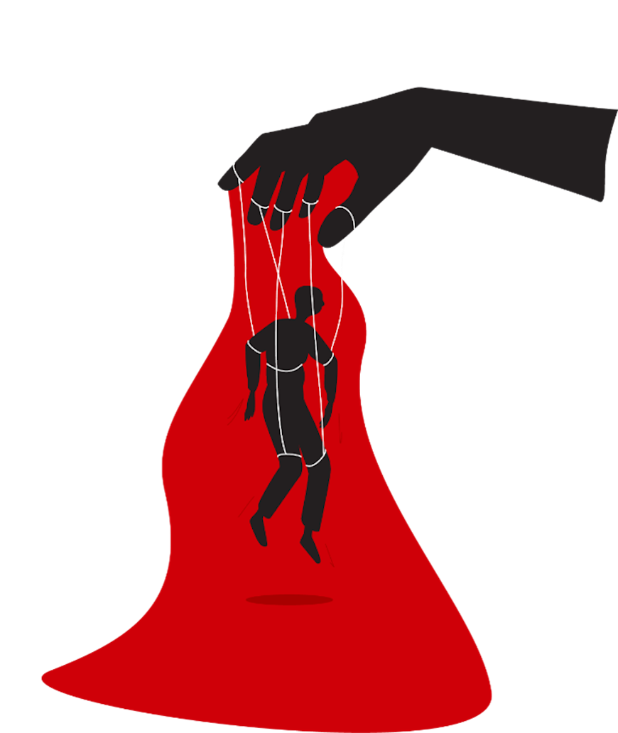
Dark patterns are website features designed to encourage us to make certain decisions. This includes spending more money on a purchase or keeping a subscription we’ve decided to end.
Seen a countdown timer once you’ve added something to your basket? Been told there's “only three seats left” when booking a flight? You’ve experienced a dark pattern.
Consumers know about this practice. Our nationally-representative survey of New Zealanders shows that 83% of us are aware businesses attempt to influence our choices with website design.
More than three quarters (77%) of us believe that businesses use dark patterns to increase revenue. As many as 56% believe they're used to mislead or pressure people.
Although we’re aware of them, we’re not immune to their effects. Almost half of respondents (47%) say that web design has influenced their choices, with 30% saying they have been negatively affected.
Dark patterns cost us money. Our research found on average, the most these patterns have cost consumers is $42. But as many as 10% of respondents said they’d spent $100 more than they’d intended due to dark patterns.
How do dark patterns work in practice?
We wanted to see how dark patterns work in practice, so we interviewed and observed 10 Consumer supporters. We watched while they bought concert tickets, booked a flight and hotel room, and cancelled a food box subscription.
We’ve applied their experiences to a hypothetical holiday and given them pseudonyms to protect their privacy.
Ticketmaster’s hidden fees and countdown timers
The first step in organising our hypothetical holiday was to buy two tickets to see James Blunt at Auckland’s Spark Arena. Standard tickets cost $149.90 and were available exclusively at Ticketmaster.
But besides the ticket price, there were $15.74 in fees per ticket as well as an $8.40 “per order” fee. Purchasers could learn what these ‘extras’ entailed via a link on the ticket selection page. None of our participants mentioned the link or clicked it prior to selecting tickets.
When we asked Michael* why he thought the price was broken down in this way, he said:
"I guess it’s to keep the initial [advertised] price down so when you start the process you're not scared away by cost. You’re more likely to make a purchase if you’ve got all the way to the check-out, rather than just looking at how much it's all going to cost.”
– Michael*
In addition to the hidden fees, customers are offered a $99 annual membership to Spark Arena and a $149 Spark Arena Premium Lounge Package. Understanding the premium packages and the additional fees requires a lot of reading, but in the top right corner is a countdown timer, adding to the pressure.
“It's taken me 2 minutes to comprehend all the various fees. I'm the sort of person who reads everything on their pay slip and wants to understand why it's there. The timer is ticking away, so I don't really have time to check with my wife. I've really got to do this now! Who knows? By the time I come back, maybe somebody else will have bought the last seats.”
– Michael*
Michael was not alone in feeling the pressure. Other interviewees described failing to notice the countdown timer until it was too late, losing their tickets and being re-directed to the original page. This led them to rush through the process a second time in order to get to the next step in the purchase process before the timer ended.
Making someone feel that they need to act urgently is a common strategy used by scammers so that victims make poor decisions. We don’t think legitimate businesses should be using the same tactic on their customers.
Ticketmaster did not provide a comment in response to this article. In response to our report on Dark Patterns, Ticketmaster told us, “We know how much these moments mean to fans, and our goal is to make buying tickets as fair and transparent as possible.
“Once tickets are added to a fan’s cart, they’re held exclusively for that fan for eight minutes - this time limit prevents tickets from being locked indefinitely and ensures everyone in the queue has a fair chance to purchase. These features are designed to manage demand fairly, not to pressure or mislead fans.”
Booking.com’s scarcity warnings
With our concert tickets booked, it was time to sort accommodation through Booking.com.
Booking.com routinely shows customers that hotels are running out of rooms at the price offered on the website. This is called a “scarcity warning” and aims to encourage customers to complete a purchase quickly.
Colour plays a key role here. While much of the text used on Booking.com is black or blue, green is used to convey benefits – like free cancellation or breakfast included – and scarcity warnings are red.
We don’t know whether these scarcity warnings are accurate or not, but we do know they are carefully worded. The website shows the number of rooms remaining “at this price on our site.” This doesn't rule out other rooms at the hotel being available at a similar or cheaper price through another website.
For our interviewees, the motivation was clear. Booking.com wants to put you in a mindset of urgency – if you don’t act now, you will lose an opportunity. “They’re trying to entice you to select them,” Amelia* said. “Look, this is the last one left! You know. It’s ‘get in now, quick!’”.
Our participants were largely sceptical of these warnings but, in the right circumstances, warnings could cause customers to take action sooner than they might have.
“I got my two kids some concert tickets and a hotel next to the venue in Auckland as a Christmas present,” Joan* said.
“When I booked accommodation for them, the closest accommodation said “3 left at this price”, and I bought it then and there. They're already booked to go. They've got air fares and concert tickets, so I’m going to be booking accommodation at some point... doing it then meant I could secure it in the best location for them."
– Joan*
Scarcity warnings might not make you spend more money, but by creating a sense of urgency, they increase the likelihood that you’ll spend it there and then, with the website you’re currently visiting, rather than shopping around or waiting a few days.
We put our claims to Booking.com. It said, “Booking.com tracks room availability in real-time. When the number of rooms available at a specific property drops below a certain threshold, the platform displays messages such as “only X rooms left" to highlight actual remaining availability.
“These indications are based entirely on the inventory provided by our partners, who remain fully in control of the room availability they choose to share with us… everything on our website, including how we display prices and payment policies as well as the availability and popularity of specific properties, is intended to help customers make informed decisions.”
Jetstar’s false hierarchy
With our tickets and accommodation booked, we just needed to sort out travel. James Blunt wouldn’t be touching down in Te Waipounamu, so we needed to fly from Dunedin to Auckland.
We wanted a relaxing experience, so we chose to fly up the day before the gig and home the day after.
Jetstar only had one flight on each day, so their use of a scarcity warning – showing just six seats left “at this price” on the outbound flight– is impactful. We needed to act fast.
The basic fare for each of the outbound and inbound flights is $79, but when we selected the flights we’re presented with a series of more attractive, more expensive, options.
The cheapest fare is bordered by a mild yellow colour and described as “our basic fare." This is in stark contrast to the most expensive “Flex Plus” fare which is bordered by a bold orange and described as “Great Value”.
In addition to showing us what’s included in the Flex Plus fare, under our basic fare we're shown everything that we’re not getting; no checked bag, no food and drink, and no free changes to date and time.
In website design, this is known as “false hierarchy”. It's where font size, colour, or placement, is used to influence consumers toward a particular choice.
As Phil* said:
“They’re trying to draw attention to the most expensive one. This pops up, its orange, so my eye went to it, and then you see ‘great value’. I [mentally] blocked out the basic fare completely … They’re trying to get you to spend more money. If I’m in a blind panic to get somewhere, I’d just click that one [Flex Plus]. But, because I’m relaxed and I’ve got time, my resistance is a bit stronger.”
– Phil*
If we did as Jetstar’s design suggested and upgraded to the Flex Plus fare, the price per ticket has jumped to $127. Basic flight tickets that would have cost $316 for two adults would now cost $508!
We put our claims to Jetstar. A representative said, “The Jetstar booking flow provides customers with a selection of bundles with a range of inclusions. The bundles are presented in logical order from the cheapest with the least inclusions, to those bundles with a more extensive collection of inclusions (for example, the Flex Plus bundle which contains the most inclusions and delivers the greatest value proposition for customers who need those features).
“Our approach reflects an accurate hierarchy based on product inclusions, provides transparent information enabling informed decision-making, and maintains clear visibility of all fare options including the base Starter fare."
It's not just Jetstar: we've done a deep dive into all the ways airlines use dark patterns to get you to spend more money.
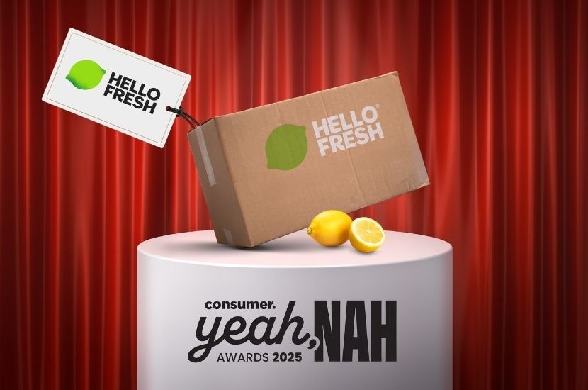
HelloFresh’s subscription traps
Finally, our trip away meant we needed to deal with our HelloFresh weekly delivery. Our HelloFresh subscription costs $89.99 per week for two meals with two servings in each meal kit. We’ve actually decided it’s time to cancel.
When we went to our HelloFresh account page, we had to scroll right to the bottom before finding the option to cancel. Immediately obvious was a bold, black button reading “Pause my deliveries”. Below was a muted button: “Cancel my plan”.
Pausing was an option, but having considered it, we decided to go ahead and click cancel. Job done, right?
Wrong. Once we clicked cancel, we were sent to a page titled “Before you decide to cancel." It showed us what we’d be missing out on if we cancelled.
In the familiar prominent black button, the text read, “Skip and keep benefits” – that is, skip the cancellation and retain your membership.
Continuing our scroll in search of the cancellation option, we were offered a 20% discount on our next two orders, with the prominent black button urging “Accept offer”.
Only at the bottom page, after we’d been shown four alternatives to cancellation, did we come to a muted button saying “Cancel anyway.” Finally, we were able to cancel.
Except we weren’t. HelloFresh demanded to know why we were leaving. At the bottom of the page, in the prominent black button, it said “I don’t want to cancel”, with a muted “continue” button underneath. You can’t cancel without providing a reason.
Even then, clicking continue wasn’t the end. On the next page, HelloFresh said it was sorry to hear we had problems. Once again, it offered to modify our plan or share an invite with a friend in return for $70 credit. After deciding we didn’t want to subject our friends to this experience, we clicked the muted button at the bottom of the page labelled “Cancel anyway”.
For John,* the motivation is clear. “If you want to cancel, you want to cancel; you don’t want to go through ten different screens.”
With that, we really had cancelled our HelloFresh membership. But finally, and surely in desperation more than expectation, HelloFresh took us to a screen that offered us the opportunity to review our plan before reactivating. And just in case we had managed to navigate the labyrinthine cancellation process by accident, there was one more button.
“I didn’t mean to cancel.”
We put our claims to HelloFresh. They said, “HelloFresh New Zealand acknowledges the feedback from Consumer NZ. Earlier this month [October] we introduced a new and improved pause and cancellation process as part of our continued focus on simplifying the customer journey to enhance the overall experience when using the app or website.”
*Not their real name.
How can we fix the dark patterns problem?
Dark patterns might mean you spend more money than you intended when making purchases, but there are other significant impacts.
These design practices are annoying. Worse, getting caught out can erode our confidence and damage our trust when making decisions in the future.
They cost us valuable time by making us hesitate, read and re-read the fine print to ensure we’re not caught out again and forcing us to confirm, then confirm and confirm again that we want to cancel a service.
But it doesn’t have to be this way. That’s why we’re calling for the government to follow the lead of the European Union, the United Kingdom, the United States and Australia.
They have – or are developing – dedicated laws that ban unfair trading practices, including dark patterns. Consumers in Aotearoa deserve the same protections.
Read more about our call for a ban on dark patterns in our report, plus our full list of recommendations to help protect you from them.