By Vanessa Pratley
Investigative Journalist | Kaipūrongo Whakatewhatewha
Consumer NZ research has revealed businesses are designing their websites to get you to spend more money online than you otherwise would.
How are they doing it? Dark patterns.

Dark patterns are website designs used to influence decisions that aren’t necessarily in your best interests. If you’ve ever found it difficult to cancel a subscription, felt rushed by a countdown timer, or struggled to close pop-up after pop-up, it’s likely you’ve encountered a dark pattern.
Consumer has done a deep dive into these practices. Our research included a nationally representative survey of 1502 New Zealanders. One of the questions asked respondents to name a website they’d seen using dark patterns.
Both of Aotearoa’s biggest airlines featured in the top 10 most mentioned sites. Jetstar was the fifth most mentioned and Air New Zealand was seventh.
So, we decided to take a closer look and discovered both of our biggest airlines use dark patterns. We visited each website on 14 November 2025, and took screenshots along the way.
Here’s what we found.
Choosing a ticket: scarcity cues
Scarcity cues are the most commonly encountered dark pattern. They’re when a website creates pressure or a sense of urgency to complete an action. According to our research, 71% of people frequently see scarcity cues online.
We found scarcity cues on both Jetstar and Air New Zealand’s websites. They popped up when selecting a fare.
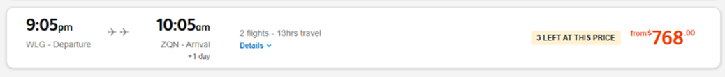
Jetstar says there are only three seats left at that price.

Air New Zealand says there are five or fewer seats available at those prices.
On both websites, scarcity cues tell you seats are running out. By signalling that tickets are limited, you might feel pressured into buying the ticket right away.
You could argue these call outs are useful, but our research showed that less than 10% of people find scarcity cues helpful. This could partly be because it’s difficult to verify if scarcity cues are true; consumers have no option but to trust they are.
We asked the Commerce Commission what work it had done to investigate whether scarcity cues in the aviation sector were misleading. Simon Pope, head of fair trading and product safety investigations said the commission had not undertaken any formal investigation.
“We are committed to protecting consumers from misleading conduct, which is why addressing false scarcity claims is a key part of our ‘online sales’ enforcement priority. In 2024, we secured a major legal victory against global ticket reseller Viagogo for multiple breaches of the Fair Trading Act, including misleading customers about its status as an official ticket seller, its role as a resale platform, and the price, scarcity, and validity of tickets,” Pope said.
A spokesperson for Jetstar said “Jetstar’s use of scarcity messages reflect our inventory data, and assist customers to make informed decisions about fare availability to ensure they don’t face disappointment when a fare sells out. In Jetstar’s case, we are required to ensure that scarcity claims are accurate and can be relied on by customers, in accordance with existing consumer law.”
Air New Zealand Chief Commercial Officer Scott Wilkinson said “We regularly review our online booking experience to ensure it best serves the needs of our customers. Notifying customers when five seats or fewer remain at a particular price point is factual information. This detail helps travellers make more informed booking decisions, particularly during peak travel periods, giving customers access to relevant information that will help with planning their journeys.”
We think scarcity cues are likely to be extra effective when it comes to airlines. With the price of flying right now, cheap tickets are a hot commodity. If they’re selling out, you’ll want to make sure you can secure one before they’re gone.
In our country, where connectivity isn’t the greatest, and flying is often the only practical way to travel to some destinations, a scarcity cue is the cherry on top of an already pressured buying experience.
Picking fare types and adding insurance: false hierarchy
False hierarchy is when one option is made to stand out compared to another option or when choices are designed in such a way that positions one as the default. The aim here is to get you to pick the highlighted option.
Jetstar uses false hierarchy when you select what kind of fare you want. It uses colour to make more expensive options stand out, with the most expensive option the most visually prominent.
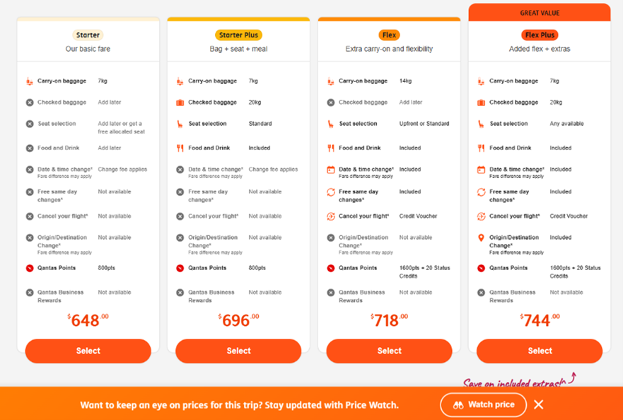
The way Jetstar’s fare options are laid out give the impression that the most expensive option is the one you should choose.
As part of our research, we took a group of 10 Consumer supporters through a range of websites, to see how they interacted with dark patterns in real time. One of the websites was Jetstar, and we asked one participant what they thought Jetstar was trying to achieve with this layout.
The answer? Get us to spend more money.
“And again, it would go back to the situation of, I’m in a blind panic to get to Queenstown, I would be like “Oh, that one. Click.” But [when] I’m more calm and relaxed and I’ve got time … my resistance is stronger.”
Jetstar disagreed. A spokesperson said “Jetstar clearly provides customers with fare and bundle options, with complete transparency about what is included in our products. The visual design is to help customers compare different value propositions quickly, to determine what is best for their circumstances. All options are clearly labelled with ‘select’ buttons.”
“Visual hierarchy is a fundamental principle of good user experience design that helps users navigate choices efficiently.”
Air New Zealand also uses this design tactic when giving people travel insurance options. The option to include travel insurance is in bold, giving the impression that this choice is the default, or even that it has been pre-selected for us.
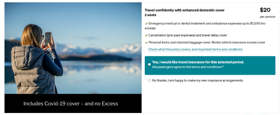
Air New Zealand highlights the option to include insurance, making it more prominent than the alternative.
If you’re not paying extra attention, you might click it or attempt to de-select it. In doing so, you’re adding $20 per person to your bill that you might not have otherwise added.
Air New Zealand said it had changed the insurance selection design. Wilkinson said “We’ve recently introduced a redesigned travel insurance offer on our online booking website for further clarity and simplicity. Travel insurance is not pre-selected and is presented with plain-language outlining what’s included, the per-person price, and a direct link to the full policy wording. We provide customers with additional reassurance through a 21-day cooling-off period on travel insurance purchases, allowing a full refund if the policy doesn’t meet their needs.”
Adding bags: confirmshaming
Confirmshaming is when a website attempts to persuade users into making a particular choice, often by using negative, emotive language.
We saw a few examples of confirmshaming when adding bags with Jetstar.
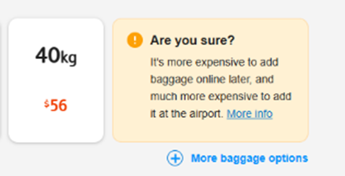
Even though we’ve chosen not to add a bag, Jetstar prompts us to reconsider.
The effect is to encourage you to second-guess a decision you’ve already made. And the reference to the cost of adding bags in the future is a not-so-subtle attempt to make you consider what-ifs you otherwise wouldn’t be swayed by. What if I accidentally pack too much? What if I do actually need an extra bag?
But the website isn’t finished yet. It makes one final request for you to reconsider. Even though you’ve already decided not to add bags twice by this point, it’s as if your own decision-making isn’t good enough.
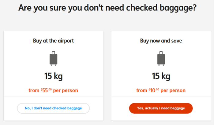
After reconsidering, and confirming we didn’t want any bags, Jetstar wants us to be extra sure.
You’ll notice the use of false hierarchy here, too: the option to add baggage is made to stand out, rather than the free option.
The cumulative effect of these prompts, one after the other, is an example in how dark patterns have the ability to wear us down and waste our time.
A Jetstar spokesperson said “Jetstar provides factual information about its baggage and cost differentials to ensure customers make informed decisions about their travel.”
“Jetstar provides this information in relation to baggage to ensure that customers do not arrive at the airport without the baggage allowance they need and face higher costs. We have added this messaging in direct response to customer feedback requesting better warning about baggage requirements. These prompts ensure customer are informed, while retaining customers’ complete autonomy to make the baggage decision that is right for them.”
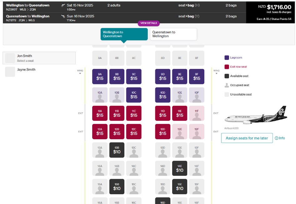
Selecting a seat: interface interference
When it came to selecting seats, we noticed there was a dark pattern at play on both airlines’ websites: interface interference.
Interface interference is when the website design encourages you to take a certain action instead of another through the way the information is laid out, displayed or hidden.
With both airlines, the way their web pages are laid out could make people think they’ve got to pick a seat.
On Air New Zealand’s site, when you arrive on the seat select page, the choose a seat options are the first thing you see. It’s only when you scroll down, you’re informed that you don’t have to pick one.
There’s a plain button on the side allowing you to skip, but it would be easy to miss next to the bold design of the seat select interface. We found when booking a one-way flight, the skip button didn’t even appear.
What the page looks like when you first load it.
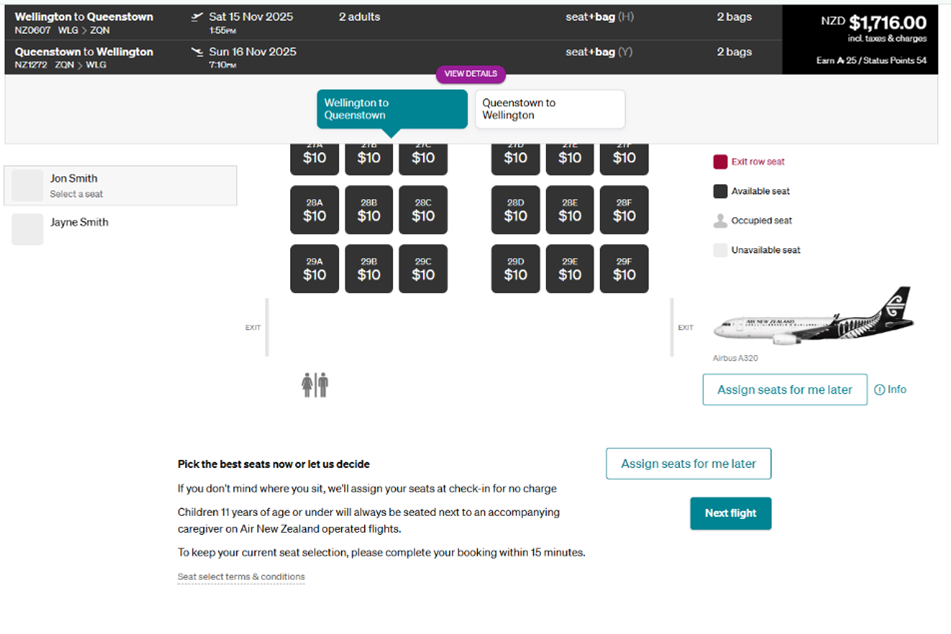
Key information can only be found at the bottom of the page. Options to skip seat selection are less prominent than other parts of the site.
If you’re not paying attention, you could end up spending $30 extra just to choose a seat.
On Jetstar’s site, you automatically land part way down the seat select page when it loads. You’d only find the information letting you know you don’t need to pay extra if you scroll up.
That’s problematic because when we’re on a website, our natural tendency is to scroll down – not up! Jetstar’s design takes advantage of our assumptions about how the page will be set up. Again, while there are options on the side to avoid paying for seat selection, the visual prominence of the seat selection interface makes it possible to miss.
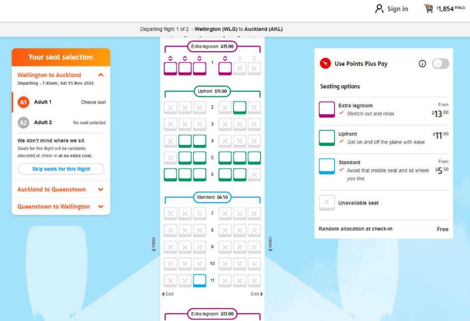
When you land on the seat select page, you can’t see the banner at the top.
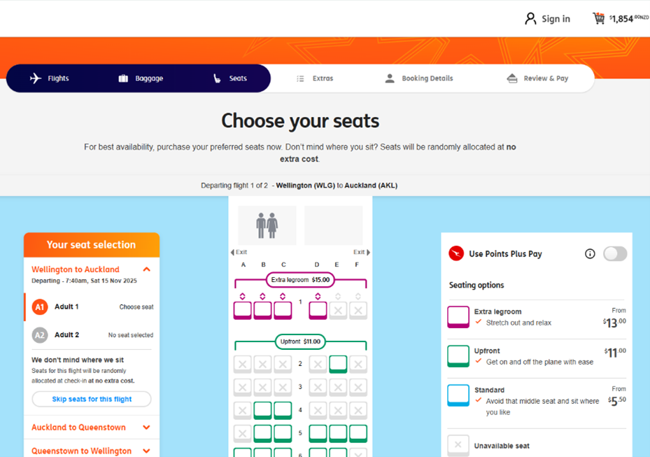
The information is only visible if you scroll up. Options to skip seat selection are less prominent than other parts of the site.
In both cases, key information is more difficult to find than it should be, and if you don’t see it, you might think you have to select a seat in order to move forward with the purchase.
Checking out: pre-selection
Pre-selection is when an option, usually a tick box, is already selected for you. It makes opting-out, rather than opting-in, the default.
Air New Zealand’s website uses pre-selection when it comes to opting into marketing emails. When you’re buying an airfare, you’ll have to remember to opt out by unselecting the box.
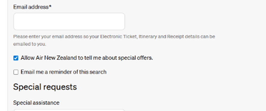
The option to receive marketing is already selected, meaning you have to opt-out rather than opt-in.
The idea is that, if you’re in a rush or expecting the option to be opt-in, you won’t go the extra step to un-tick the box. For any business, more people on a mailing list equals more opportunities to generate revenue.
While this example of a dark pattern might not get you to spend more money there and then, by providing your details for the airline’s marketing, there’s a chance you’ll spend more money in the future on a deal or trip you might not have otherwise sought to buy.
There’s always the option to unsubscribe once you’re signed up, but that’s another extra step you shouldn’t have to take.
Time to end unfair
We’ve only got two major domestic airlines. Consumers often don’t have the choice to avoid their websites, and there’s little they can do to combat the dark patterns they’ll find there.
If you’re flying in Aotearoa, you’re exposed to dark patterns. Elsewhere in the world, governments are better equipped to tackle dark patterns and their harms.
But our country’s laws mean most dark patterns are unregulated and consumers are feeling the effects. Our research shows New Zealanders want action on dark patterns.
So, how can we stop businesses from using dark patterns to extract more money, time and data from us?
We recommend:
Aotearoa adopting a general ban on unfair trading, similar to existing and developing bans being employed overseas
improving privacy protections through changes to the Privacy Act
strengthening the enforcement powers of regulators
increasing penalties issued under the Fair Trading Act
developing guidelines for businesses to help them mitigate the use of dark patterns and to make online commerce a safer space.
Read about our research in more detail or read the full report.
Dark patterns and digital deception in Aotearoa New Zealand
Our research has found that these dark patterns are wasting New Zealanders' money and time.